


William Martin
As for the graphic elements I intend to include, I plan on including pictures of the new stadium, graphs and charts of economic data projecting the impact the super bowl will have on the metropolitan area, tables on average and historical weather and climate conditions for the metropolitan area during the month of february. There is another type of graphic which I wanted to get your opinion on. Being that we are in an internet world, and many published articles, essays, and research are posted on the web, I was thinking about posting links to webcasts and videos in my field guide. I have found a couple of interesting videos, including but not limited to, a clip from the actual presentation that the giants owner gave before the league. I would love to know what your thoughts are with regards to this idea.
List of Graphical Elements by Alyssa O'Toole
"Balancing the Budget One Musician At A Time"
1) FY 2010 Budget Gaps as a Percentage of General Fund Budget
a. This will show most importantly that California has a budget gap exceeding 20%. It will also provide the reader with an understanding of what other states are facing budget gaps and to what extent. It will serve the comparative purposes.
b. http://www.commissions.leg.state.mn.us/lcpfp/NCSL%20Budget%20Update%2010%2019%2009.pdf →Slide 4
2) Proposed Budget Solutions (Figure INT-03)
a. This will show revised budget solutions for 2010-2011 (expenditure reductions, federal funds, alternative funding and fund shifts and other revenues) in millions. It will also show totals as a percentage. This will demonstrate that California is using expenditure reductions as its primary method of closing its budget gap.
b. http://www.ebudget.ca.gov/pdf/Revised/BudgetSummary/FullBudgetSummary.pdf→Page 4
c. In the event that this is not enough-I will also incorporate a graphical representation of New York State’s solutions to closing its gap. This will be a pie graph taken from its 2010-2011 Executive Budget.
3) Use of Spending Cuts as a Percentage of Actions to Close FY 2010
a. This is another graph displaying nationwide dependency on spending cuts for closing budget gaps. Again it demonstrates the grave constraints the entire nation, including California, is facing.
b. http://www.commissions.leg.state.mn.us/lcpfp/NCSL%20Budget%20Update%2010%2019%2009.pdf→Slide 5
c. I’d like to use this in alliance with the next graphical element, which portrays state dependency on ARRA funds-yet another form of closure that cannot and will not persist.
4) Use of ARRA Funds as a Percentage of Actions to Close FY 2010 Budget Gaps (Preliminary)
a. As mentioned previously, this graph will demonstrate state dependency on ARRA funds. ARRA will be a term that I define in my lexicon. It is the American Recovery and Reinvestment Act of 2009 that was created as a direct response to the economic crisis. It has raised federal funds for education by $224 billion. Once these funds dry up, states will be in the same positions they were in before they were allocated the extra monies This may mean that education hasn’t even faced the worst and perhaps the worst fiscal years are to come.
b. http://www.commissions.leg.state.mn.us/lcpfp/NCSL%20Budget%20Update%2010%2019%2009.pdf→Slide 6
Lena Hong's List of Graphic Elements
Many of my graphic elements will come from charts and statistics because nothing can be better than real life numbers to distinguish the facts. Finding pictures of my idea is difficult because it is not a “thing” that someone can take a picture of, it is more of a process. Therefore, I have found images that explain the process of how scientists change the organisms.
Lena Hong
Andrew Williamson's List of Graphic Elements
My Field Guide will make use of many different graphic elements. These will include charts, graphs, and diagrams and pictures that will depict what happens and what is going on in the process of Geothermal Energy. Here are several examples that I have compiled and will most likely use in the guide:
1) This is map of the United States, indicating which areas that have the most geothermal resources at 6 km under the surface. It shows that Western United States has the most potential with the technology that is currently available.
http://en.wikipedia.org/wiki/File:Geothermal_resource_map_US.png
2)The next graphic elements are diagrams of how geothermal energy is produced. It shows the 3 main processes that geothermal energy is converted from hydrothermal fluid into electricity. I am not sure if I will use all three on this page yet.
http://www1.eere.energy.gov/geothermal/powerplants.html
3)This page has a wonderful animation of how Enhanced Geothermal Systems work. It shows how the drills make injection and production wells and how the water moves and how it will provide so much potential. Once I find a way to incorporate it, it would be very useful to have.
http://www1.eere.energy.gov/geothermal/egs_animation.html
4) This next graphic is a chart that has the projected energy cost of all energy sources in 2016, including fossil fuels, nuclear and geothermal. It shows that it has the highest capacity factor, tied with advanced nuclear, and is cheap compared to the other renewable resources, and some nonrenewable. This will be very helpful.
http://en.wikipedia.org/wiki/File:Levelized_energy_cost.jpg
This is not all of the graphics that are available and as I find more, I will add them as needed.
Andrew Williamson
Janette Wambere
Graphic Elements
For my guide I intend to use mostly graphs and tables that contain statistical data or results from different researches to make clear and explain my points better. I will also add in several photos and pictures to accompany the text. Below are some of the graphical elements that I will most likely include in my field guide:
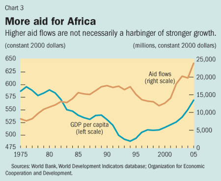
1. This is a graph that tracks the trend of aid and the GDP of Africa over a period of time. The graph proofs that more aid does not necessarily mean stronger growth for the continent.
http://www.imf.org/external/pubs/ft/fandd/2007/12/images/bio3.gif
2. This is a graph of the results acquired after a study was carried out in four different countries, France, Germany, the United Kingdom and the United States. People in these countries were asked which they thought was more effective, trade or aid. Sixty four per cent of the respondents thought trade to be more effective than aid. http://www.austrade.gov.au/images/UserUploadedImages/1438/austrade-trade-over-aid.gif
3. There are two graphs here, one that tracks aid and democracy in Africa while the other tracks aid and democracy in the world. These two clearly show the relationship between aid and democracy. http://filipspagnoli.files.wordpress.com/2009/03/democracy-and-aid-the-curse-of-aid.jpg
4. This is a graph of the top 10 donors to the world food program. The United States is at the top of the list with the second being EC, more than 1000 million dollars behind the states. http://www.whitehouse.gov/omb/budget/fy2003/images/bud20d.jpg


